

What good looks like at every stage from impression to closed deal — and the numbers that tell you whether to scale or stop.
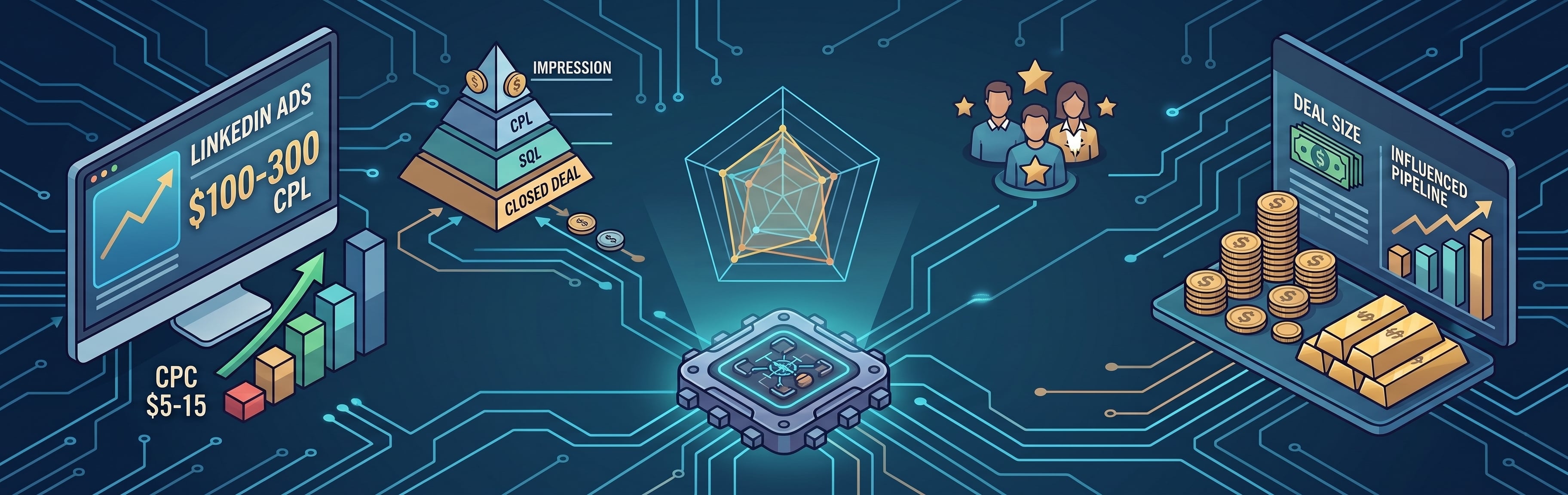
TL;DR: LinkedIn CPCs run $5–15 and CPLs $100–300 for B2B SaaS — three to five times Google's equivalents. Judged on those numbers alone, the channel looks indefensible. When judged by cost per SQL, deal size, and pipeline influence per dollar, it usually wins. This article provides benchmark ranges for each funnel stage, broken down by ads, outreach, and organic, plus the thresholds that separate a program worth scaling from one worth cutting.
The problem is that cost per lead doesn't tell you what a lead is worth. LinkedIn-sourced deals close 28.6–35% larger than Google-sourced ones, which changes the maths entirely. And the benchmarks most teams compare against don't help either, because a platform-wide average blends cybersecurity with HR tech and $5K deals with $80K deals into a single number that fits no one. What follows is the benchmark set broken down by stage, motion, and vertical — so you can see which part of your funnel is underperforming and which part is simply expensive by design.
Why Do LinkedIn Benchmarks Look Bad Until You Segment Them?
Start with the headline numbers so you can check yourself against them. For B2B SaaS, LinkedIn Ads CPC ranges $5–15, CPL ranges $100–300, and CTR averages 0.44–0.65% — figures three to five times higher than the Google Ads equivalents.
Three variables move those ranges more than performance quality does:
- Vertical. A cybersecurity company paying $15 CPC is at benchmark. The same CPC for an HR Tech product would be double the benchmark. Compare against your vertical or the comparison tells you nothing.
- Ad format. Thought Leader Ads run 2.68% CTR at $2.29 CPC, roughly six times more efficient than single-image ads. A blended "good CTR" figure averages these together and is unusable for either.
- ACV. A $200 CPL is unaffordable at $5K ACV and cheap at $80K. No published benchmark accounts for this, which is why so many teams conclude their performance is poor when it's appropriate for their deal size.
The correction that settles the budget-review argument: LinkedIn-sourced deals run 28.6–35% larger than Google-sourced deals. The CPL comparison was never like-for-like. Measure LinkedIn by CPL, and you'll underfund it. Measure by pipeline-to-spend ratio and you'll scale it.
See also: What Is a Qualified LinkedIn Lead? MQLs, SQLs, and Pipeline Explained
What Should You Measure at Each Stage From Impression to SQL?
|
Stage |
Metric |
B2B SaaS range |
What a miss indicates |
|
Impression → click |
CTR |
0.44–0.65% feed; 0.80%+ top quartile
|
Audience fit or creative hook |
|
Click → lead |
CPL |
|
Offer specificity |
|
Lead → MQL |
MQL rate |
Varies by MQL definition
|
Scoring model weighting |
|
MQL → SQL |
MQL-to-SQL rate |
|
Qualification criteria |
|
SQL → opportunity |
SQL-to-opp rate |
|
Follow-up speed and handoff |
|
Spend → pipeline |
Influenced pipeline per $1 |
|
Target-account coverage |
If you run one number this quarter, run influenced pipeline per dollar. It collapses the entire chain into a single figure a CFO can act on without a briefing. Median influenced pipeline sits at $5.21 per dollar spent, with top performers reaching $15.20 — based on 211 B2B companies and $5.5M in ad spend across 29 countries.
That threefold spread between median and top quartile is the useful part. The separators are consistent spend, heavier use of Thought Leader Ads, and target-account coverage over broad lead volume — none of which require a larger budget.
|
Do your LinkedIn benchmarks show what to fix next? A channel-level average will not tell you whether the issue is CTR, offer, MQL quality, handoff, or cost per SQL. Review performance by stage before deciding whether to scale or stop.
|

What Are Realistic Benchmarks for LinkedIn Ads?
Blended ad benchmarks are the least useful numbers in circulation. A single "good CTR" figure averages formats that perform nothing alike, and comparison only works within a format.
|
Format |
CTR |
CPC |
|
Thought Leader Ads |
||
|
Single-image ads |
Platform average (0.44–0.65%) |
~6x TLA cost per click |
Thought Leader Ads running at roughly six times the efficiency of single-image ads is the highest-leverage reallocation available to most B2B SaaS advertisers — and it costs nothing beyond restructuring existing budget.
Two further numbers worth holding:
- ROAS. LinkedIn averages 113% for B2B SaaS, against Google at 98% and Meta at 104%. This is the return figure to bring to a budget conversation instead of CPL.
- Cost trend. B2B technology CPCs rose 8% year over year as more B2B budget moved onto the platform. Budget for that increase annually — flat CPCs year over year is an outperformance signal, not a neutral result.
One timing note for annual phasing: launching in Q1 buys more clicks for the same spend, though CTR runs lower in that period.
See also: LinkedIn Ads vs. Sales Navigator vs. Organic LinkedIn: Which Works Best for B2B Lead Generation?
What Are Realistic Benchmarks for Sales Navigator Outreach?
Published outreach numbers vary more than any other benchmark in this article, and the variance tracks who's publishing them. Platform-wide data across 13.2 million outreach attempts gives 28.5% connection acceptance and 10.4% message reply. Companies selling personalization software publish 45% acceptance and 25–35% reply. Benchmark against the large-sample figures and treat the higher numbers as a ceiling under ideal conditions.
The numbers to hold:
- Connection acceptance (cold): 27–28.5%
- Message reply after acceptance: 10–11%
- Connection-note reply: 3.0%, and declining
Two patterns in the data are worth acting on, because both point at sequence design rather than volume or targeting:
- Reply rates are holding; note replies are not. Message reply rates stayed within 10–11% across the year while monthly request volume rose about 13% — no saturation effect on acceptance. The connection-note reply rate is the one number eroding. If your sequence depends on the note doing the work, it's built on the weakest signal in the set.
- Warming outperforms personalizing. Across 150,000+ connection requests, cold requests were accepted 27% of the time, rising to 41% after one or two comments on the prospect's posts — then falling back to 36% after four or more. Timing compounds it: warmed requests sent within 24 hours of the last comment hit 44% acceptance, dropping to 33% after a month.
Geography changes the diagnosis entirely. North America and Western Europe average around 10% reply rates, Ireland reaches 17%, and Japan and South Korea sit near 3% for cold DMs, where warm introductions are strongly preferred. Benchmarking a DACH campaign against a US campaign will tell you the sequence is broken when the market is simply different.
|
Do you know which LinkedIn motion is underperforming? Ads, Sales Navigator, and organic content need different benchmarks. Audit each motion separately so you can see whether the problem is paid efficiency, outreach quality, or engagement from the wrong audience.
|
How Do You Benchmark Organic Content When There's No CPL?
Organic has no spend denominator, so cost-based benchmarks don't apply. Programs default to engagement metrics instead — reactions, impressions, follower growth — none of which predict pipeline.
The metric that does is the ICP-fit rate of the people engaging. Across 7,793 LinkedIn engagements from 50+ B2B founders, only 2.9% of engagements came from ICP-fit prospects overall — but niche industry content reached a 15–22% ICP-fit rate, while viral or generic content delivered under 1%.
That reframes what a successful post looks like. A post with 400 reactions at a sub-1% ICP-fit rate produced less pipeline value than one with 30 reactions at 20%.
Four numbers replace the engagement metrics, and each one connects to something downstream rather than sitting in a content report:
- ICP-fit rate of post engagers — the primary number, target 15%+
- Profile views from target accounts, weekly
- Inbound connection requests from ICP personas
- Connection acceptance lift on outreach to accounts that engaged with content versus those that didn't
The last one settles the internal argument about whether founder content earns the time it costs. It's the only organic metric that converts directly into a defensible pipeline claim, and producing it takes a single HubSpot segment comparison: accounts that engaged with content in the last 90 days against those that didn't, compared on acceptance and reply rate. The warming data above suggests the spread will be substantial.
When Should You Scale a LinkedIn Program — and When Should You Stop?
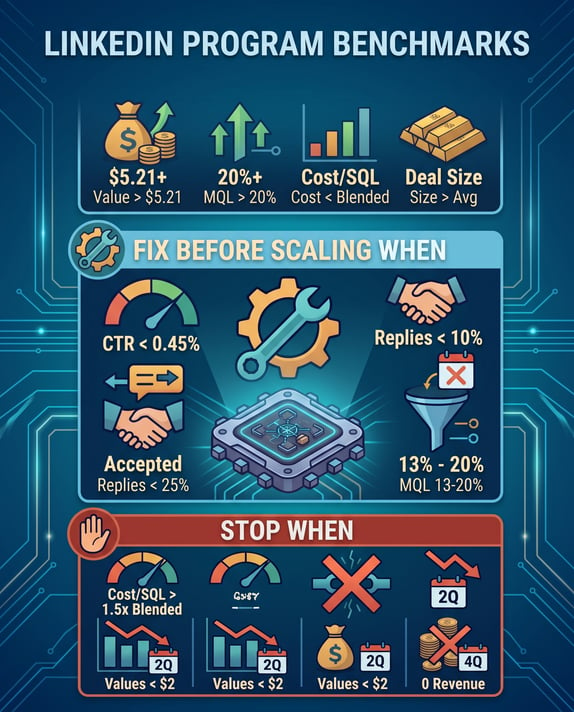
The thresholds below assume at least two quarters of data. Anything shorter reflects the learning period rather than the program.
Scale when:
- Influenced pipeline per dollar is above $5.21 and trending up across two consecutive quarters
- MQL-to-SQL on LinkedIn-sourced leads is above 20%
- Cost per SQL is at or below your blended cost per SQL across all channels
- Deal size on LinkedIn-sourced opportunities is at or above your average
Fix before scaling when:
- CTR is under 0.45% on feed formats — audience fit or creative hook, diagnosed before adding budget
- Connection acceptance is under 25% — targeting precision, not volume
- Reply rate is under 10% with no message iteration in 30 days — the message is the variable
- MQL-to-SQL sits between 13% and 20% — qualification criteria, covered in the qualified lead article
Stop when:
- Cost per SQL exceeds your blended cost per SQL by more than 50% after two full quarters of iteration
- Influenced pipeline per dollar sits below $2 with no upward trend across two quarters
- No closed-won revenue attributable to LinkedIn after four quarters at meaningful spend
One caveat keeps this framework honest. None of these thresholds are readable without attribution configured correctly, and the stop conditions are the ones most likely to fire on bad data — a program that appears to have produced no closed-won revenue may have produced plenty and logged it as direct traffic. Confirm the tracking before you act on the numbers.
See also: How to Connect LinkedIn Lead Generation to HubSpot Attribution
Benchmarks Are a Diagnostic, Not a Scorecard
The function of a benchmark is to tell you which stage of your funnel to work on next. A program beating benchmarks on CTR, CPL, and acceptance rate while missing badly on cost per SQL has a specific, findable problem — it's reaching the right people with an offer that doesn't convert them. That diagnosis is available in an afternoon and worth more than any channel-level average.
Pull your own numbers at all six stages before the next budget cycle. The argument for or against LinkedIn spend is won with a stage-level diagnosis, and lost with a channel-level average — which is the form the argument usually takes, and the reason good programs get cut.
Key Takeaways
- CPL is the wrong number to defend LinkedIn with. LinkedIn-sourced deals close 28.6–35% larger than Google-sourced ones. Bring pipeline-to-spend ratio to the budget review instead.
- Blended benchmarks describe no real company. Thought Leader Ads run at 2.68% CTR against a platform average of 0.44–0.65%. Compare within your format, vertical, and ACV tier or the comparison misleads you.
- Outreach benchmarks depend on who published them. Platform-wide data gives 28.5% acceptance and 10.4% reply. Vendor-published figures run twice that — treat them as a ceiling, not a target.
- Organic content should be measured on ICP-fit rate, not engagement. Niche content reaches 15–22% ICP-fit engagement; viral content delivers under 1%. A post with 30 reactions from the right accounts beats one with 400 from the wrong ones.
|
Are your LinkedIn results bad, or just badly benchmarked? If benchmarks are strong at the top of the funnel but weak after MQL, the next move may not be more budget. Find out where performance breaks before expanding spend.
|