

Mastering search engine optimization (SEO) is essential for businesses to effectively reach their target audience, increase online visibility, and drive qualified leads. If you're in B2B marketing, you know that SEO isn’t just an option — it's necessary.
Follow step-by-step instructions on building and implementing a winning B2B SEO strategy that positions your business for growth. Let’s jump right in!
B2B SEO Strategy - The Basics
SEO in B2B marketing is more than just increasing traffic; it’s about connecting with the right people. Unlike B2C, where the goal is often to capture broad interest, B2B SEO focuses on reaching specific decision-makers ready to engage.
Recent B2B SEO statistics show that instead of relying on industry publications or trade shows, 66% of B2B buyers use internet search results as their primary resource when researching products they intend to purchase.
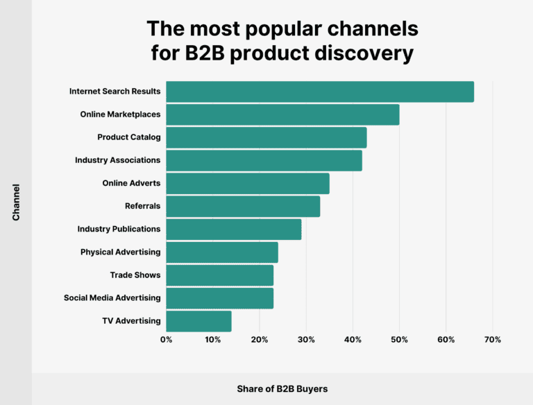
Image source: Backlinko
Given the long sales cycles and complex buying processes in B2B, a tailored SEO strategy is at the forefront. This means staying ahead of trends, understanding your audience's evolving needs, and optimizing your approach.
What is B2B SEO?
B2B SEO (business-to-business search engine optimization) involves optimizing your website and content to rank higher in search engine results for terms relevant to your business. Unlike B2C SEO, which often aims for broad appeal, B2B SEO targets niche markets and specific keywords that company decision-makers are searching for.
The unique aspect lies in its focus on long-term relationships and high-value sales. The content needs to resonate with professional audiences, answer specific pain points, and provide valuable insights. This often involves crafting detailed guides, white papers, case studies, and research-backed content that positions your brand as a thought leader in your industry.
B2B SEO has several distinct characteristics that set it apart from its B2C counterpart:
- Targeted audience: In B2B, your target market isn't a broad demographic group, but rather a small group of decision-makers within a company, such as marketing managers, CEOs, or small business owners.
- Search volume and intent: B2B keywords often have lower search volumes than B2C ones, but their purpose is more specific and sales-oriented.
- Content types: The most effective content formats for B2B tend to be more educational and informative, such as white papers, case studies, and in-depth blog posts, rather than the more visual and entertaining content that thrives in the B2C world.
- Sales cycles: B2B sales cycles are generally much longer than B2C, requiring a more nuanced and patient approach to SEO and B2B content marketing.
|
Generate more leads with SEO Learn proven strategies and insights to attract more qualified leads, boost revenue, and optimize your digital marketing.
|

B2B SEO vs. B2C SEO
While Google's ranking factors apply equally to B2B and B2C websites, the overall strategy and approach can differ significantly.
|
B2B SEO |
B2C SEO |
|
|
Target audience |
Businesses, decision-makers, and industry professionals |
Individual consumers |
|
Sales cycle |
Longer, multi-step sales cycle, often involving multiple stakeholders |
Shorter, often impulsive purchases |
|
Keyword strategy |
Focus on long-tail, niche, and technical keywords that align with industry-specific needs |
Broader, more general keywords with higher search volume |
|
Content type |
In-depth, detailed content such as whitepapers, case studies, technical guides |
Product pages, reviews, user-generated content, and blog posts |
|
Search intent |
Research and informational (e.g., solutions, ROI, case studies) |
Transactional or informational (e.g., product details, comparisons, reviews) |
|
Conversion goals |
Lead generation (form fills, demo requests, whitepaper downloads) |
Direct sales, email signups, product purchases |
|
SEO tactics |
Focus on building authority through in-depth content and backlinks from industry-relevant sources |
More emphasis on building brand awareness and driving immediate conversions |
|
Content length |
Typically longer-form content (1,500+ words) to demonstrate expertise |
Shorter-form content focused on quick answers and product details |
|
Link-building strategy |
Authority-driven, often focusing on niche publications, industry forums, and partnerships |
Volume-driven, focusing on a mix of high authority, general blogs, influencers, and product reviews |
|
Social media role |
Less critical for SEO but important for authority building (LinkedIn, Twitter) |
Plays a significant role in driving traffic (Instagram, Facebook, Pinterest) |
|
Buyer journey stages |
Focus on awareness, consideration, and decision stages |
Focus on awareness and conversion stages |
|
Technical SEO |
Strong focus on complex site architecture, schema markup, and optimizing for multi-stakeholder navigation |
Simpler site structures, faster navigation, optimizing for a broader audience |
|
Metrics and KPIs |
Focus on leads, demo requests, and organic traffic growth from decision-makers |
Focus on sales, traffic volume, and direct consumer engagement |
Key Differences
While B2C focuses on short buying cycles and high volumes, B2B targets longer sales cycles, multiple decision-makers, and niche audiences. This impacts everything from your content type to how you approach keywords.
Approach to Keywords
In B2B SEO, keyword strategy emphasizes specificity and intent. Instead of targeting high-traffic keywords, focus on terms that align with the specific problems your audience is trying to solve. Long-tail keywords are precious here, as they capture detailed queries from prospects further along in the decision-making process.
ExampleIn B2B, you'll typically target keywords with lower search volumes (e.g., "industrial automation software") compared to the high-volume, more generic keywords (e.g., "running shoes") that B2C marketers often focus on. |
Content Types That Work Best
B2B content is more educational, solution-oriented, and geared towards the specific pain points and challenges your target decision-makers face. B2C content, on the other hand, is often more focused on product features, brand storytelling, and appealing to the consumer's emotions.
White papers, in-depth blogs, case studies, and webinars are more effective for engaging professional audiences. These content types help build authority and trust, which is critical for B2B lead generation.
Promotional Channels
While B2C companies may succeed with social media platforms like TikTok or Instagram, B2B businesses often gain greater traction through channels like industry publications, email marketing, and LinkedIn.
Biggest Challenges for SEO in B2B
The extended sales cycle in B2B can make it more challenging to measure the immediate impact of your SEO efforts, requiring a more patient and long-term approach.
Image source: AUQ.io
It requires sustained engagement over months or even years. Your SEO strategy must provide value at every stage, from awareness to decision-making, using a mix of educational and solution-oriented content.
|
Generate more leads with SEO Learn proven strategies and insights to attract more qualified leads, boost revenue, and optimize your digital marketing.
|
Multiple Decision-Makers
In B2B, buying decisions often involve multiple stakeholders with different interests and concerns. Your SEO content must address these varying perspectives, ensuring each decision-maker finds the necessary information.
Niche Markets
B2B SEO often targets highly specialized industries. This can make it challenging to find relevant keywords and create content that reach the right audience. However, it also presents an opportunity to become a leading voice in a niche market.
Building a Winning B2B SEO Strategy in 2025
Start by developing a comprehensive SEO strategy that aligns with your overall marketing goals. This involves identifying your target audience, understanding their needs, and mapping out how SEO can support each stage of their buyer's journey.
Integration with Overall Marketing
Your SEO strategy shouldn’t exist in a silo; it should be integrated with your broader marketing efforts. For example, align your SEO content with your content marketing, email campaigns, and social media strategies to create a cohesive brand experience.
Measuring Success
To measure the effectiveness of your B2B SEO strategy, focus on key metrics such as organic traffic, leads generated, conversion rates, and return on investment (ROI). Tools like Google Analytics, SEMrush, and Ahrefs can help track these metrics and provide insights into areas for improvement.
How to Create an SEO Strategy
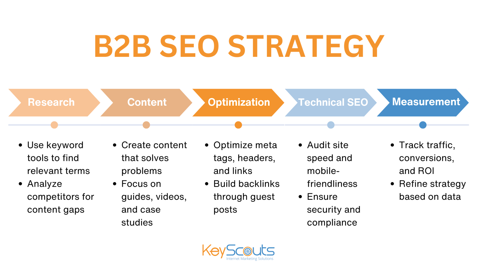
1. Research and Planning
Start with in-depth keyword research to identify the terms and phrases your target audience is searching for. Use tools like SEMrush, Ahrefs, and Moz to find keywords with high relevance and low competition. Competitor analysis is also critical — study what your competitors are ranking for and identify gaps you can fill. It will help you uncover new opportunities and find ways to differentiate your offering.
- Conduct in-depth keyword research
- Analyze your competitors' strategies
2. Content Development
Once you have your keywords, it’s time to develop content that aligns with your business goals and customer needs. Create high-value content that addresses common pain points, offers solutions, and showcases your expertise. Think about long-form content like ultimate guides, which can comprehensively answer your audience's questions.
- Create high-value, informative content that addresses your target audience's specific pain points and challenges.
- Focus on long-form, evergreen content like ultimate guides, white papers, and detailed blog posts.
- Experiment with different content formats, such as video, webinars, and case studies, to engage your audience.
3. On-Page and Off-Page Optimization
Ensure all aspects of SEO are covered, from optimizing meta tags and headers for clarity and relevance to establishing strong internal linking structures that guide users through your content efficiently. Off-page optimization should focus on building quality backlinks through partnerships, guest blogging, and content syndication.
- Ensure your website is optimized for both search engines and user experience, with clear and relevant meta tags, headers, and internal linking structures.
- Leverage schema markup to enhance your search engine visibility and provide more detailed information to users.
- Build high-quality backlinks through strategic partnerships, guest blogging, and content syndication.
4. Technical SEO
Don't forget to regularly audit and update your website’s technical SEO elements, such as URL structures, redirects, and site architecture, to maintain optimal performance.
- Optimize your website for speed and performance, as B2B users often have less patience for slow-loading pages.
- Ensure your website is mobile-friendly and compliant with security and data privacy regulations.
5. Measurement and Analysis
Finally, establish a robust measurement and analysis plan to track the effectiveness of your SEO strategy. Focus on key metrics such as organic traffic, keyword rankings, conversion rates, and leads generated.
Use tools like Google Analytics, SEMrush, and Ahrefs to monitor performance and identify areas for improvement. Regular analysis will help you make data-driven decisions to refine your strategy and maintain a competitive edge in your industry.
- Track key performance metrics beyond just traffic, such as lead generation, conversion rates, and return on investment (ROI).
- Use data and analytics to continuously iterate and improve your B2B SEO strategy.
Keyword Research for B2B SEO
B2B keyword research is more focused on intent and specificity. Instead of broad keywords, target specific phrases that indicate a strong buying intent or a need for in-depth information.
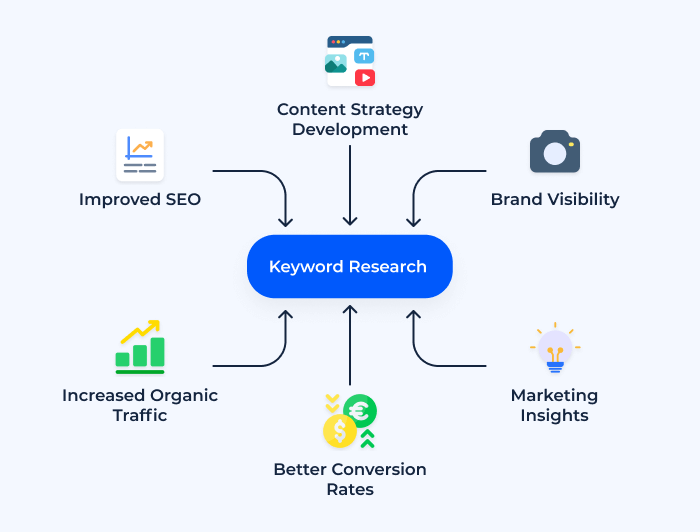
Image source: Sitechecker
Go beyond the basics and use advanced tools like SEMrush, Ahrefs, and Google Keyword Planner to identify gaps and opportunities. Consider competitor gap analysis to find keywords your competitors are ranking for that you are not.
|
Generate more leads with SEO Learn proven strategies and insights to attract more qualified leads, boost revenue, and optimize your digital marketing.
|
Long-tail keywords are crucial in B2B because they are more specific and often indicate a higher intent to purchase or engage. Although these keywords may have lower search volume, they tend to drive more qualified traffic.
- Focus on intent, not just volume: Instead of chasing high-volume keywords, B2B marketers should prioritize terms that align with the specific pain points and purchase intent of their target decision-makers.
- Leverage long-tail keywords: Long-tail keywords (e.g., "industrial automation software for manufacturing plants") are often more relevant and less competitive in B2B.
- Utilize competitor analysis: Examine the keyword strategies of your top competitors to uncover new opportunities and identify areas where you can differentiate your offering.
- Leverage advanced keyword research tools: Go beyond basic keyword research tools and explore more sophisticated options like SEMrush, Ahrefs, and Moz to uncover deeper insights and more relevant keywords.
Developing a Content Strategy
Your content should provide value by addressing pain points, offering solutions, and establishing your brand as a thought leader. Use data, insights, and real-world examples to back up your claims.
Long-form content, such as ultimate guides and evergreen pieces, is essential because it continues to attract traffic over time. This type of content helps establish your website as a reliable resource in your industry.
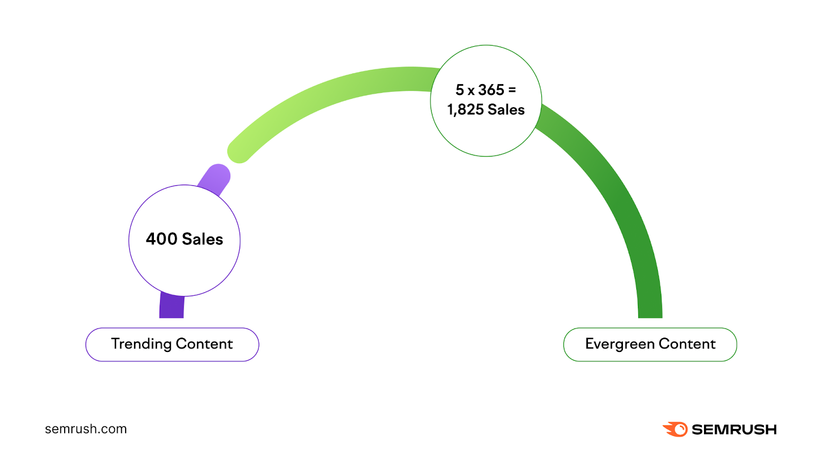
Image source: Semrush
Content Formats That Work Best
Focus on content formats that resonate with B2B audiences, such as white papers, case studies, detailed blogs, and videos. Leverage AI to streamline content creation and personalization.
- Focus on addressing pain points: Develop content that directly addresses the specific challenges and pain points faced by your target decision-makers.
- Leverage long-form, evergreen content: Long-form content like ultimate guides, white papers, and detailed blog posts tend to perform better in the B2B space, as they provide more in-depth information and stand the test of time.
- Experiment with different formats: In addition to written content, explore other formats like video, webinars, and case studies to engage your audience.
- Utilize AI for content creation and personalization: Leverage AI-powered tools to streamline the content creation process and deliver personalized experiences to your B2B audience.
On-Page B2B SEO Best Practices
On-page B2B SEO requires a more targeted approach compared to general SEO because of the complex buyer journey and decision-making process in B2B markets. The focus is not just on ranking for high-traffic keywords but on attracting qualified leads through relevant, niche-specific content.
Keyword research in B2B SEO often involves long-tail, industry-specific terms aimed at decision-makers. Crafting compelling meta tags, title tags, and headers with clear, concise messaging that speaks directly to business pain points is critical. In addition, optimizing content to highlight case studies, whitepapers, or data-driven insights can help build credibility and engage users at different stages of the buying process.
Lastly, it benefits from a strong internal linking structure, guiding users through a logical content journey to nurture leads more effectively.
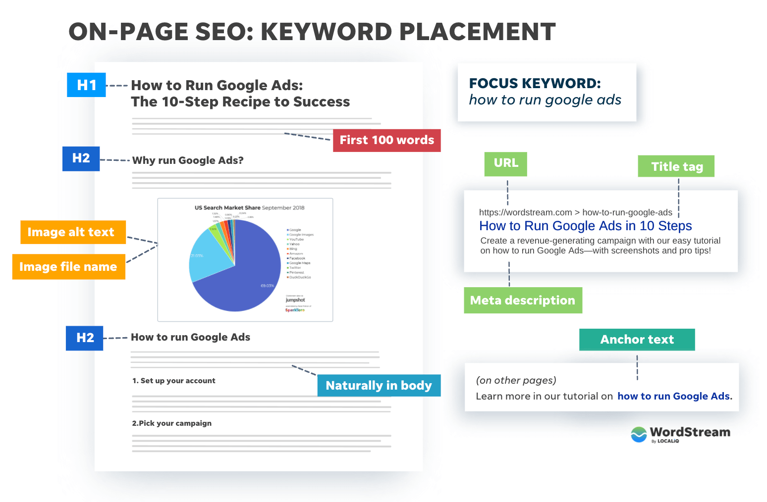
Image source: WordStream
Optimizing Meta Tags and Headers
Ensure your titles, meta descriptions, and headers are laser-focused on the needs and intent of your target decision-makers. They should be clear and relevant to your B2B audience. Use keywords naturally and provide enough context to entice users to click.
Internal Linking Structures
Develop a robust internal linking structure. Guide B2B users through your content efficiently, helping them quickly find the information they need.
Schema Markup for B2B
Use structured data to enhance search visibility, providing search engines with additional context about your content.
Technical SEO for Websites
Addressing the technical aspects of your B2B website is crucial for maintaining a strong SEO foundation. Key considerations include:
Site Speed and Performance
Fast load times are crucial for B2B users, who often access websites from a range of devices and locations. Ensure your website loads quickly, as B2B users often have less patience for slow-loading pages Optimize images, scripts, and other elements to ensure your site loads quickly.
Mobile Optimization
With the growing importance of mobile in B2B decision-making, make sure your website is mobile-friendly and provides a seamless user experience. Use responsive design and test across multiple devices.
Security and Compliance
Adhere to security best practices, such as HTTPS, and maintain compliance with regulations like GDPR to avoid any negative SEO impact.
Link Building
Building a strong backlink profile is essential for B2B search engine optimization success. Some effective strategies include:
Strategic Partnerships and Guest Blogging
Collaborate with industry-relevant websites and publications to secure backlinks. Build high-quality links through partnerships with industry influencers and guest blogging on reputable sites.
Content Syndication
Leverage platforms like Medium, LinkedIn, and industry-specific sites to syndicate your content and earn valuable links.
Case Studies and Testimonials
Encourage clients and partners to link back to your site, especially if you feature them in case studies or testimonials.
Measuring and Analyzing B2B SEO Success
Tracking the right metrics is crucial for understanding the impact of your SEO efforts. While traditional metrics like traffic and rankings are important, it's equally crucial to focus on lead generation, conversion rates, and return on investment (ROI).
Photo by 1981 Digital on Unsplash

Additionally, embrace the power of AI and automation to gain deeper insights and make more informed decisions about your B2B SEO strategy.
- Go beyond traffic and focus on metrics like leads, conversion rates, and ROI to gauge the effectiveness of your SEO efforts.
- Regularly review your data and analytics to identify trends, gaps, and opportunities for improvement.
- Use AI and automation tools to gain smarter insights and make more data-driven decisions.
Future Trends in B2B SEO
As we look ahead, a few emerging trends are poised to shape the future of B2B SEO:
The Impact of AI and Machine Learning
AI and machine learning are transforming SEO, from content creation to data analysis. Expect to see AI-powered tools and techniques play an increasingly significant role in content creation, keyword research, and data analysis and stay ahead by integrating these technologies into your strategy.
Voice Search and B2B
With the growing popularity of voice-activated devices, B2B marketers will need to optimize their content and website for natural language queries.
Sustainability and SEO
As environmental, social, and governance (ESG) factors become more important in B2B decision-making, SEO strategies will need to adapt accordingly. Brands with strong ESG practices may find it easier to rank as consumers and businesses prioritize sustainable practices.
Key Takeaways for a Successful B2B SEO Strategy
By integrating data-driven SEO solutions, businesses can tap into the power of B2B lead generation SEO, driving consistent traffic and fostering long-term growth.
- Understand the unique characteristics of B2B SEO and how it differs from B2C strategies.
- Conduct thorough keyword research to identify the terms and phrases that align with your target decision-makers' search intent.
- Create high-value, informative content that addresses the specific pain points and challenges faced by your audience.
- Optimize your website for both search engines and user experience, with a focus on technical SEO, on-page factors, and effective link building.
- Measure and analyze your SEO performance using a mix of traditional and forward-looking metrics, leveraging AI and automation where possible.
- Stay up-to-date with emerging trends and be prepared to adapt your strategy accordingly.
|
Generate more leads with SEO Learn proven strategies and insights to attract more qualified leads, boost revenue, and optimize your digital marketing.
|

