It may not seem obvious right off the bat, but pricing pages play a crucial role in converting a website visitor into a customer. After all, it’s on the pricing page where the most important part of the buyer journey takes place!
Take HubSpot for example. After designing and optimizing their pricing page, they were able to increase the number of MQLs the page generated by 165%! They also increased sign-ups for their free products by an impressive 89%.
This important part of the conversion funnel needs to be done right if you want your website to help you drive sales. So, to help make sure you’re on the right track, we’ve put together six key steps you should follow for optimizing the pricing page.

By implementing these steps, you’ll help ensure a smooth and efficient buyer journey that concludes with more conversions.
1. Keep It Simple
Ever heard of “analysis paralysis”? This is what happens when a customer has too many options to consider, so they overthink the possibilities and end up not making any decision at all. The best way to avoid this is by keeping it simple.
This rule comes up again and again in website design, and it couldn’t be more important than when it relates to your pricing pages.
The last thing you want to do when a site visitor reaches your pricing page is overwhelm them. One of the most common mistakes we see in poor pricing page design are pages that include way too much information about different options and features.
MailChimp, for example, simply explains their different pricing options and features in a table form. Notice that in a table, the customer isn’t overwhelmed and important information is conveyed with ease.
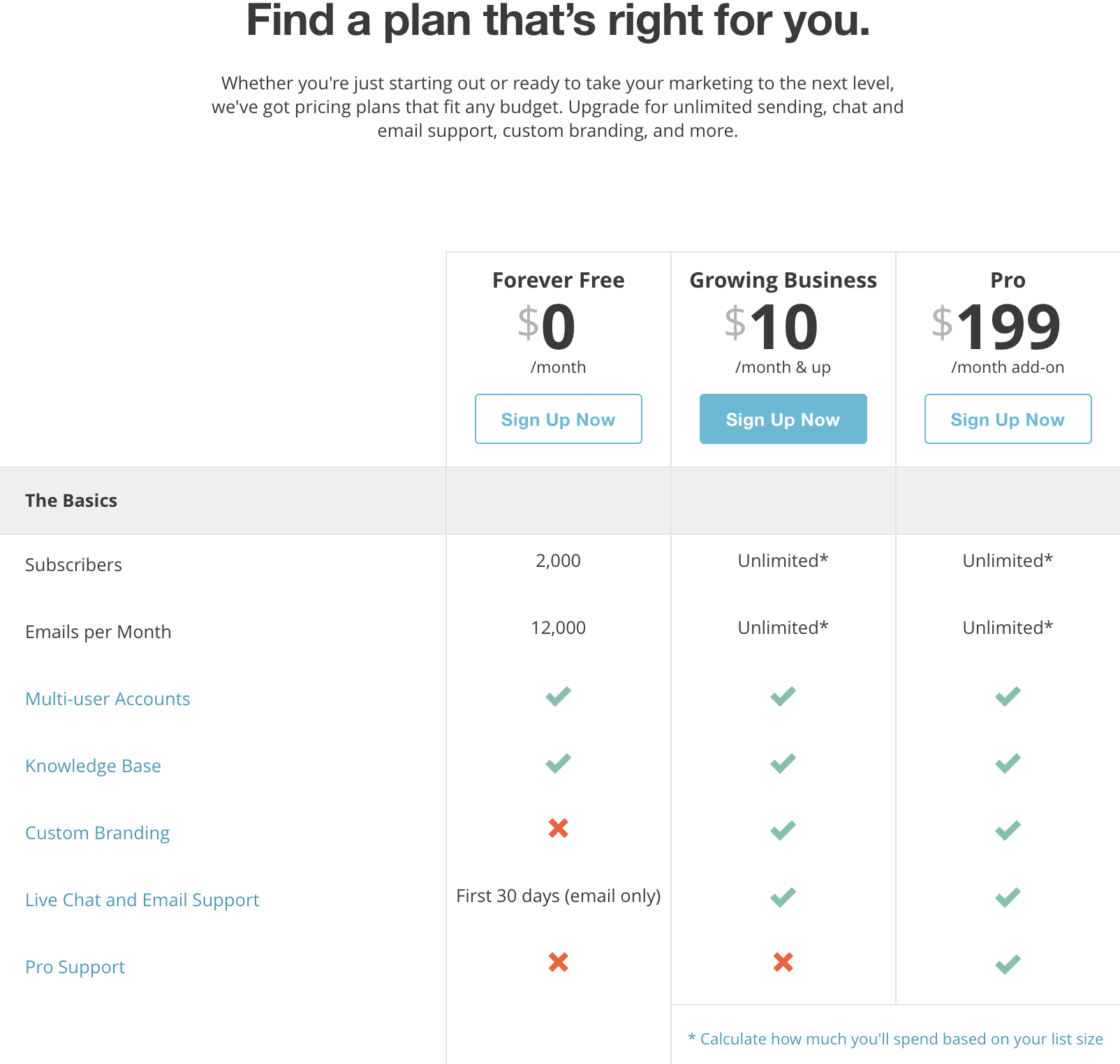
By this stage in the conversion funnel, you’ll be better serving your site visitors and significantly improving your website performance by offering a clean overview of your offering without overdoing it. Keep it simple: Offer only the key highlights and most important information that will help the interested buyer make a decision.
2. Guide Customers In Choosing The Plan You Want Them To Choose
Did you know that, when presented with two options, buyers are more likely to choose the first one they saw, even if both options are identical? Further, by throwing a third option into the mix you can actually guide customers towards the choice you want them to make.
This is called the “decoy effect”, and by incorporating it into your pricing page you can help increase revenue. By including a strategically priced third option, you can guide buyers to choosing a more expensive option than they would have chosen otherwise. Take a look at Slack’s pricing page below for a great example.
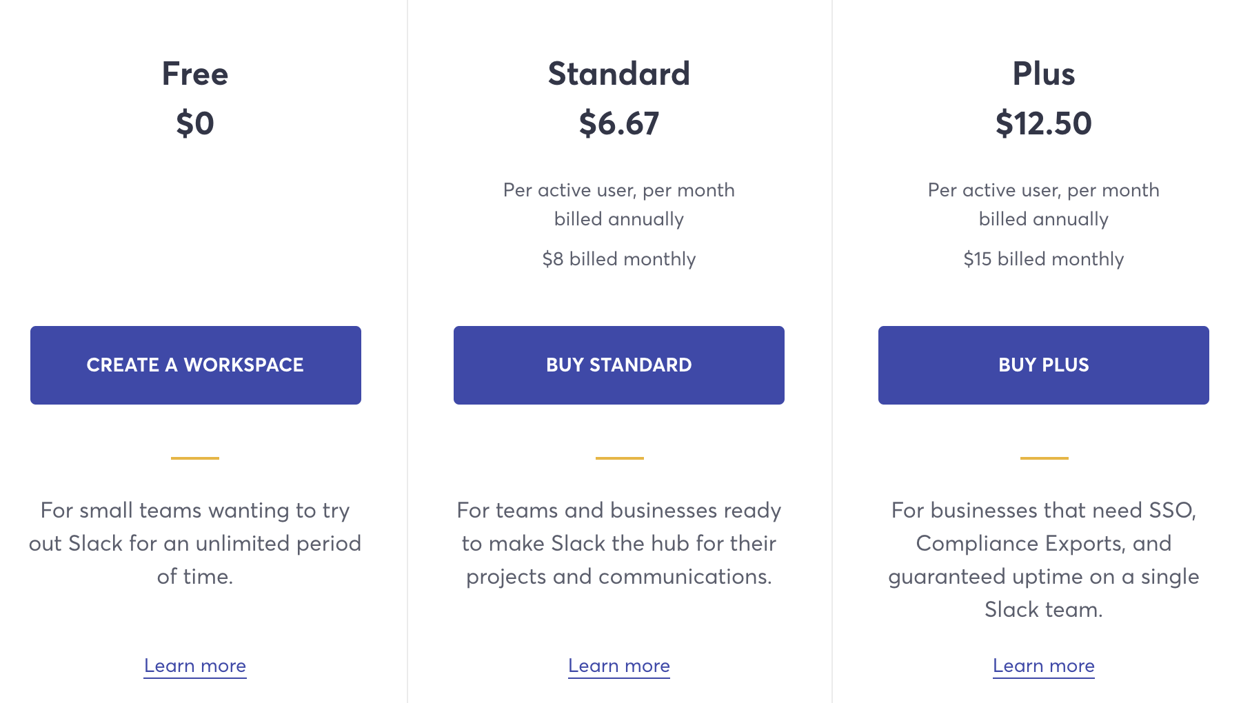
Using the decoy effect, you’ll typically want to present the option that you want buyers to choose as the middle choice. And to further encourage buyers to select that option, you can highlight it as the “most popular” plan your other customers chose.
3. Make Use Of Free Trials & Limited Time Offers
Human beings are complex. Can you believe that people feel the pain of loss more strongly than the pleasure of gain, and their motivation to avoid loss is stronger than their desire to gain pleasure?
It may sound crazy, but that’s the theory of loss aversion. You can use this to your benefit on your pricing page by offering free trials, promoting limited time offers, and using messaging geared towards triggering this psychological phenomenon.
Once someone has experienced and enjoyed your product through a free trial, paying for it will be an obvious next step in order to avoid the psychological pain of losing it. With limited time offers, you’re using an expiration date to trigger the sense of loss aversion and more quickly convert site visitors into customers.

4. Offer Discounts On Longer-Term Or Larger Pricing Plans
Offering discounts on your pricing page can do more for your conversions than you might think. If you take into consideration the psychological concept of hyperbolic discounting, you’ll understand why. This concept refers to the tendency of people to prefer a reward that comes sooner or immediately over a greater reward that they will receive later, down the line.
Use the practice of hyperbolic discounting to your advantage by offering discounts on larger pricing plans and long-term packages. This will trigger the buyer’s preference to enjoy the payoff of a discount immediately, and it will dramatically help you increase sales.
5. Show Testimonials
Testimonials mean more nowadays than they ever have before. That’s because people are listening to each other—especially online, and especially about products they’re considering spending money on.
For some, testimonials and online reviews even have more of an impact on their buying decision than any other information about the product or company they might find online.
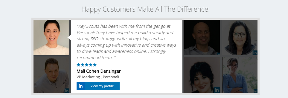
For these reasons, it’s crucial to show off the good things people have said about you, and the pricing page is an essential place to do so. Highlight your testimonials and show potential buyers how satisfied your existing customers are.
You can even embed a clean and attractive testimonial widget that displays the pictures and links to social media profiles of the people who wrote testimonials, giving them even more authenticity. This will also help you build trust with your potential customers. Spectoos is a great tool to accomplish this and can be easily embedded on any page.
6. Address FAQs
There are a few important benefits to addressing FAQs and doing so where potential buyers will notice it most. First, it shows that you care about your customers and their concerns. Like displaying testimonials, putting FAQs on your pricing page will also help build trust and make customers more confident in their decision to purchase. Check out Slack’s FAQ section, which appears at the bottom of their pricing page.
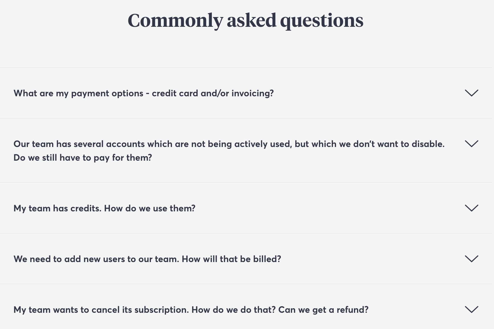
Moreover, using FAQs to address buyers’ FUDs (fears, uncertainties, and doubts) quickly puts to rest any concerns that might stop them from purchasing. FAQs offer a simple and effective way for them to have their greatest concerns addressed immediately, so they can continue on their buying journey with confidence.
A Winning Pricing Page
Your pricing page has the potential to be one of the most powerful and influential pages on your website. It allows potential customers to easily scan their various purchasing options while also gaining ease in their decision-making through testimonials and FAQs.
If you have any questions about how to power up your pricing page, improve your buyer journey, or increase your conversion rate, contact us at KeyScouts, today. We are always here and happy to help!